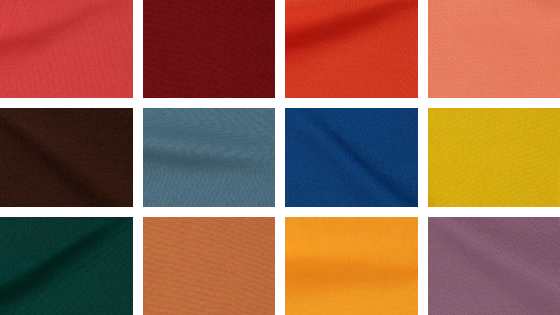
As we are expected each year, the PANTONE Fashion Color Report Spring 2017provides a comprehensive overview of fashion designers’ use of color in their spring 2017 collections: this season the trends talk about the mixture of Vitality, Relaxation and the Great Outdoors.
From colors that are bright and vivid to those that convey a sense of earthiness, The top colors for Spring 2017 fashion, as they suggest, are:
GREENERY
That is, the Color of the Year for 2017. Bringing forth a refreshing take, Greenery is a tangy yellow-green that speaks to our need to explore, experiment and reinvent. Illustrative of flourishing foliage, the fertile attributes of Greenery signals one to take a deep breath, oxygenate and reinvigorate.
NIAGARA
Comfortable and dependable, Niagara leads the PANTONE Fashion Color Report as the most prevalent color for spring 2017. Niagara is a classic denim-like blue that speaks to our desire for ease and relaxation.
PRIMROSE YELLOW
By contrast, Primrose Yellow sparkles with heat and vitality. Inviting us into its instant warmth, this joyful yellow shade takes us to a destination marked by enthusiasm, good cheer and sunny days.
LAPIS BLUE
Conveying even more energy is Lapis Blue. Strong and confident, this intense blue shade is imbued with an inner radiance.
FLAME
A red-based orange, Flame, is gregarious and fun loving. Flamboyant and vivacious, this wonderfully theatrical shade adds fiery heat to the spring 2017 palette.
ISLAND PARADISE
Island Paradise is a refreshing aqua that calls to mind a change of scenery. A cool blue green shade that speaks to our dream of the great escape, Island Paradise is emblematic of tropical settings and our desire to unwind.
PALE DOGWOOD
Continuing the tranquil mood, Pale Dogwood is a quiet and peaceful pink shade that engenders an aura of innocence and purity. The unobtrusive Pale Dogwood is a subtle pink whose soft touch infuses a healthy glow.
PINK YARROW
Tropical and festive, Pink Yarrow is a whimsical, unignorable hue that tempts and tantalizes. Bold, attention getting and tempestuous, the lively Pink Yarrow is a captivating and stimulating color that lifts spirits and gets the adrenaline going.
KALE
Evocative of the great outdoors and a healthy lifestyle, Kale is another foliage-based green that conjures up our desire to connect to nature, similar to the more vivacious Greenery. And, just as we see in nature, this lush and fertile natural green shade provides the perfect complementary background to the more vibrant tones in the palette.
HAZELNUT
Rounding out the spring 2017 colors is Hazelnut, a key neutral for spring. This shade brings to mind a natural earthiness. Unpretentious and with an inherent warmth, Hazelnut is a transitional color that effortlessly connects the seasons.
Now, search for your favorites colours and make your combinations. Find ideas and inpiration in our stores at The Corner Adeje. We wish you a happy and colorful seasonal shopping!