September begins, and the month brings us the new Autumn Winter 2019-2020 season.
With it, there is also a new color palette. The Pantone Fashion Color Trend Report. The top colours for men’s and women’s fashion for the upcoming season, from London.
This palette was the catwalks protagonists around of the most prestigious brands fashion collections, within fashion circuits. And from now, will finally be seen in the streets
For years we have been following this trend to illustrate the proposals of our stores. We like to surf betwen the different shades that will color the season with personality and style.
London’s Fall / Winter 2019/2020 color palette offers endless combinations. And they serve as an inspiration guide when it comes to finding that perfect style, with which you can create your own identity.
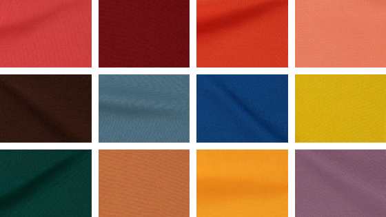
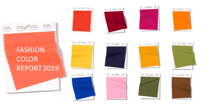
Through the Pantone Fashion Color Trend Report, the color history for the Fall / Winter season of 2019/2020 suggests 12 very special shades, which they define as:
PANTONE 17-1545
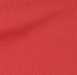
Cranberry
Cranberry is a vital red that adds a pungent punch to the palette.
PANTONE 19-1534

Merlot
A fortifying wine shade Merlot display sophistication and depth.
PANTONE 17-1450
Summer Fig
Rich in flavor, Summer Fig infuses a touch of exoticism to the fall palette.
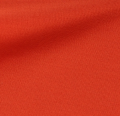
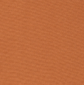
PANTONE 16-1532
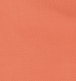
Crabapple
Bringing warmth and comfort, orangey- rose Crabapple looks as though it were baked by the sun.
PANTONE 19-1419
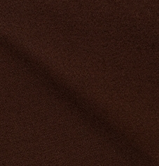
Chicory Coffee
Robust and tasteful Chicory Coffee introduces an element of heartiness.
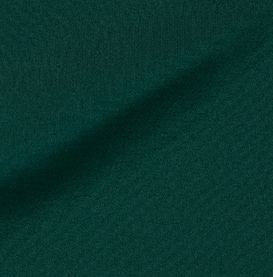
PANTONE 18-4217
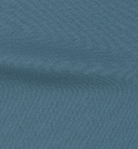
Bluestone
Bluestone is a color of quiet resolve.
PANTONE 19-4055
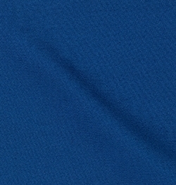
Galaxy Blue
A thoughtful blue hue, Galaxy Blue is evocative of the greater galaxy.
PANTONE 16-0840
Antique Moss
An arresting yellow-based green Antique Moss displays sharp contrast to the autumn/winter color palette.
PANTONE 19-5230
Forest Biome
Forest Biome is a foresty green shade suggestive of the color of autumn flora.
PANTONE 17-1143
Hazel
A mellow brown, Hazel is thought of as an organic natural tone.
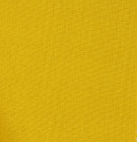
PANTONE 15-1147
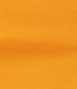
Butterscotch
Butterscotch is a deliciously appealing golden yellow.
PANTONE 18-3211
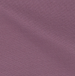
Grapeade
The distinctive Grapeade is a notable muted mauve tone.
We hope you find this guide interesting and useful.
As you alredy know, at The Corner Adeje you can find a whole universe of fashion, footwear and accessories and a remarcable Shopping & Leisure experience. Now captained by chromatic stories that speak about good taste, entertainment and style, in Costa Adeje.
Follow us through Instagram or Facebook and discover the trends every week, in full (seasonal) color .
We will wait for you!