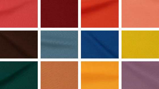
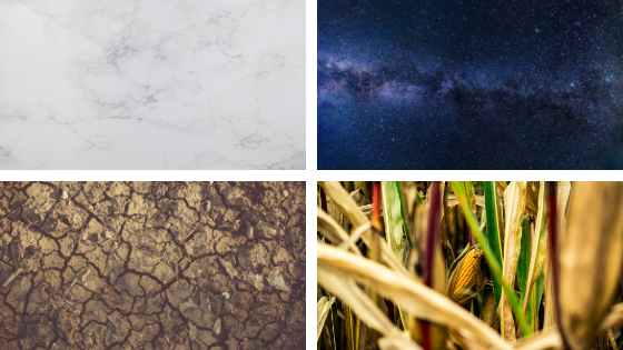
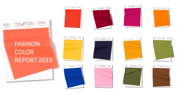
Fashion Colour Trends for this season are amazing. Ten palettes are the key this autumn and winter: Terrain, saturated earth colors makes the most influential mark, notably due to the comeback of brown tones. Neutrals are notably darker than before. And the vision of the designers and catwalks offers a vibrant palette of brights. The mid-tones are decidedly more vibrant. And finally, we can find soft and cleanse palette, with barely-there pastels.
The roster of the fall/ winter 2016 color trends is led by:
RIVERSIDE | A cool and calming blue that is stuck between serious navy blue and vibrant cobalt blue. It has some sense of confidence and tenacity to it, even sophistication and a dose of mystery.
AIRY BLUE |This colour represents the weightlessness and freedom of soaring the skies. It’s an optimistic hue that nods to spring’s soothing Serenity. Airy Blue is a great transitional color as we move into fall. Pair it with blush, coral, and white.
SHARKSKIN |Grey palette has always been in attendance at fall/winter runway shows year in year out, but it came this time as a Sharkskin to work triumphantly all over the map whether with bright or muted shades, whether in everyday life or on special occasions.
AURORA RED | The fall/ winter 2016-2017 color trends offer red shades ranging from burgundy and carmine to crimson and scarlet. As Pantone’s Institute say, this colour gets the metaphorical blood of the palette pumping.
WARM TAUPE | Characterized by Pantone as trusted, organic and grounded and approachable enough to be matched with each of the 9 colors on the list. This neutral is the new best friend of your wardrove.
DUSTY CEDAR | Get carried away by this warm and welcoming shade of muted pink that is comes as one of the best fall/ winter 2016-2017.
LUSH MEADOW | There’s something so elegant about this particular shade of emerald. This color talks about elegance and elevates the more natural greens. It is bright, vibrant, and sophisticated.
SPICY MUSTARD | There are several possibilities with this colour, but think into the idea of pairing spicy mustard with sage green and a few neutrals. The sage is muted enough so that only one color–yellow–makes a huge impact. This is important so that the color palette doesn’t get away from you and become overwhelming.
POTTER´S CLAY |The hue belongs to a more traditional fall color scheme, mingling brilliantly with other shades of brown and orange.
BODACIOUS | Bodacious speaks to the gender fluidity we continue to see. Lends itself to vibrant color combinations Unexpected in fall Versatile; can be used with Pinks and Reds Bright, rich Purple, with hints of a more sophisticated Pink.
What is your favourite?
See you on the next editoral! and each day into the #thecorneradeje Shopping & Leisure.
SOURCE: www.weconnectfashion.com

